A strong remodeling company website should help homeowners, property managers, business owners, developers, and construction partners answer four questions quickly: does this company handle my type of project, can it show relevant completed work, does its process feel organized, and how do I start a productive consultation? The best remodeling company website design examples pair high-impact photography with concise messaging, clear residential and commercial paths, and a simple way to move from inspiration to a qualified project conversation.
The ten examples below show how remodeling contractors can structure modern, visually led websites around real customer decisions—from kitchens, bathrooms, whole-home renovations, additions, and outdoor transitions to offices, retail spaces, multifamily properties, hospitality environments, and occupied commercial work.
Remodeling company website design examples: quick overview
- Transformation-led positioning: Open with strong completed work and separate residential and commercial paths.
- Visual service selection: Help visitors choose kitchens, bathrooms, whole-home, additions, office, retail, or multifamily work quickly.
- Guided project planning: Collect property, scope, style, timing, and inspiration without presenting a long form.
- Case-study proof: Pair before-and-after imagery with scope, design decisions, challenges, and finished results.
- Commercial capabilities: Give professional buyers clear information about sectors, phasing, coordination, documentation, and bid intake.
- Process transparency: Explain discovery, design, selections, planning, construction, communication, and closeout.
- Material and design guidance: Turn finishes and layouts into a useful visual decision experience.
- Occupied-space planning: Show how scheduling, access, dust control, safety, and business continuity are considered.
- Local relevance: Connect service areas to nearby projects, property types, and consultation availability.
- Bilingual experience: Provide complete English and Spanish journeys from project research through follow-up.
What a high-performing remodeling company website needs
Remodeling is highly visual, but polished photography alone does not explain whether a contractor is the right fit. A high-performing website combines inspiration with the information customers need to evaluate scope, experience, process, communication, and next steps. The strongest modern layouts use fewer words on each screen, generous spacing, and deliberate links into deeper service and project content.
| Website element | What it should accomplish |
|---|---|
| Clear market positioning | Identify the residential and commercial work the company performs, the properties it serves, and the geographic market. |
| Relevant project proof | Let visitors filter completed work by project type, space, market, scope, and design direction. |
| Concise service structure | Give every core service a focused page without crowding the homepage with excessive copy. |
| Useful planning guidance | Explain process, design decisions, materials, timing factors, access, communication, and realistic next steps. |
| Qualified consultation intake | Collect enough property and project context to route the inquiry while keeping the experience fast on mobile. |
| Credible operations | Present team roles, documentation, safety, warranties, reviews, and credentials accurately. |
A modern website design strategy connects project inspiration, service clarity, credible proof, local visibility, and follow-up into one conversion-focused system.
1. Lead with transformation and two clear customer paths
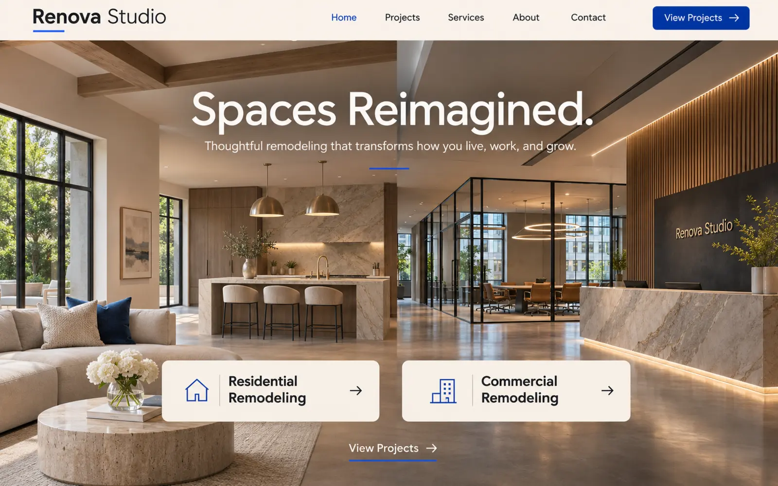
A remodeling website should feel like the work it represents: considered, modern, and easy to navigate. This concept uses one large completed-space image, a short value proposition, and two prominent paths—Residential Remodeling and Commercial Remodeling. The first screen avoids dense paragraphs and gives visitors an immediate way to identify the experience that applies to them.
The supporting proof should reflect the projects the company wants to win. Residential visitors may need kitchens, bathrooms, additions, whole-home renovations, and exterior transitions. Commercial visitors may need offices, retail, multifamily, hospitality, or tenant improvements. A compact trust row can reinforce verified reviews, relevant credentials, and completed-project experience without competing with the main image. Use authentic completed work whenever a project is presented as the company's own.
Keep the hero concise. A specific line such as “Residential and commercial spaces redesigned for how people live and work” communicates more than a broad quality claim. Pair it with Explore Projects and Plan Your Project actions, then move supporting details into the relevant customer journey.
2. Use a visual service selector instead of a wall of text
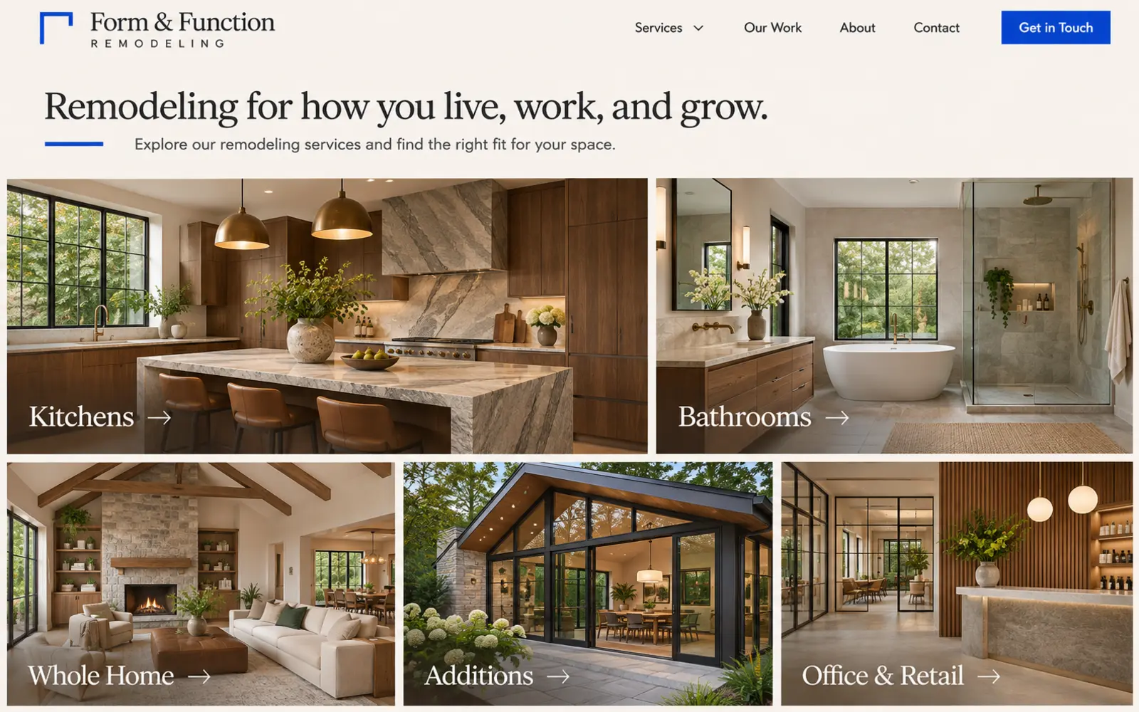
Visitors usually begin with the space they want to change. This concept uses large image cards for kitchens, bathrooms, whole-home renovations, additions, office interiors, retail spaces, and other services the contractor genuinely performs. Each card contains only a service name and a short action, allowing the photography and hierarchy to do most of the communication.
Every selection should lead to a focused page with relevant projects, the typical process, common planning questions, service-area information, and a consultation action. Residential and commercial services can share the same design system while using different project proof and qualification questions.
Avoid listing dozens of services on the homepage. Group related work under understandable categories and use the deeper pages to explain demolition, layouts, finishes, cabinetry, flooring, lighting coordination, accessibility, tenant improvements, or other actual capabilities.
3. Turn the inquiry form into a visual project planner
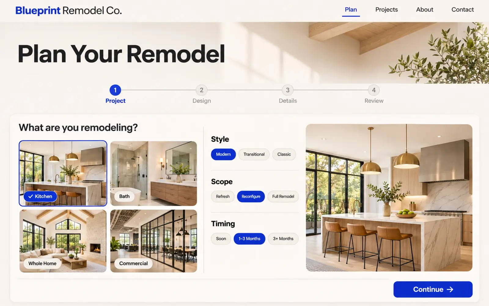
A blank message box gives the estimating team little context, while a long technical form creates friction. This concept uses a short sequence with large visual choices: property type, space or project category, primary goal, preferred style direction, approximate timing, location, and optional inspiration or site photos.
Conditional questions keep the planner relevant. A kitchen project may ask about layout changes and cabinetry. An office renovation may ask about square footage, occupancy, operating hours, procurement stage, and plan uploads. Include “not sure” options so customers are not required to diagnose code, structural, mechanical, or design conditions.
The confirmation should explain the next step clearly: initial review, discovery call, site consultation, document review, or another company-specific process. Connect every submission to reliable routing and follow-up rather than treating the form as a standalone feature.
4. Build project case studies around the decision, not just the reveal
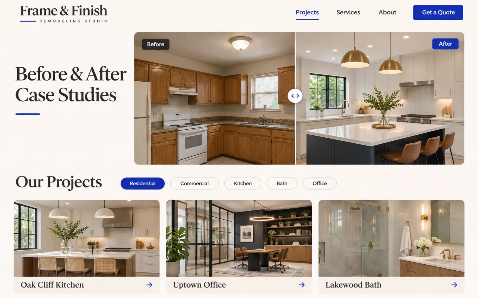
Before-and-after imagery earns attention, but useful context turns it into evidence. This concept gives each project a focused story: the original condition, customer objective, project scope, important design decisions, constraints, selected features, and finished result. A concise layout keeps the visuals dominant while providing enough information to demonstrate relevant experience.
Let visitors filter projects by room or property type, project scope, and design style—for example kitchens, bathrooms, additions, whole homes, offices, retail, multifamily, hospitality, modern, transitional, or traditional work the company actually performs. Before, in-progress, and completed views, material close-ups, plan details, and construction milestones can help customers understand the work behind the final photograph.
Do not imply that inspiration images, renderings, or stock photography are completed projects. Clearly label visualizations and use authentic project photography for portfolio proof. Optimize galleries carefully so image quality does not compromise page speed.
5. Give commercial remodeling its own capabilities experience
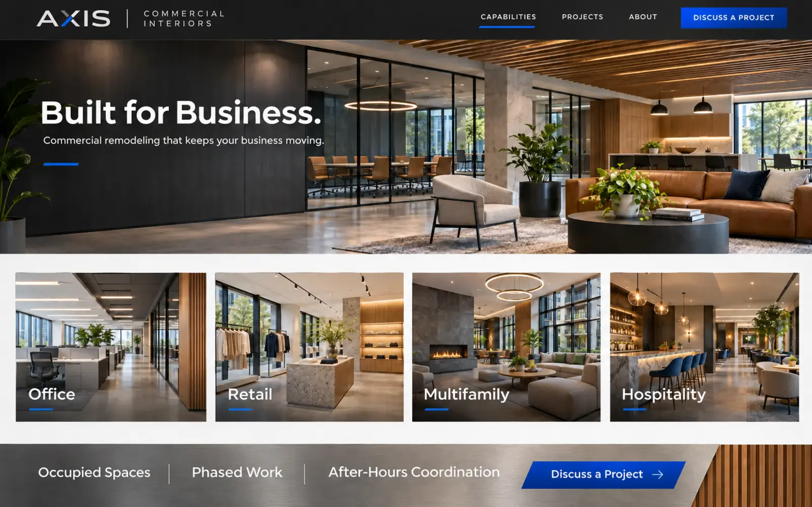
Commercial decision-makers evaluate more than visual style. This concept gives business owners, property managers, developers, general contractors, and facility teams a dedicated path with markets served, representative scopes, project range, scheduling, phasing, occupied-space coordination, documentation, and a direct estimating contact.
Use sector cards for offices, retail, multifamily, hospitality, healthcare, education, or other environments the company can support. Case studies can explain the project objective, operating constraints, coordination requirements, sequence, and closeout without disclosing confidential information.
A project-intake area can accept location, property type, desired scope, procurement stage, target timing, plans, specifications, and bid invitations. Publish only current, verifiable claims about insurance, bonding, safety, licenses, certifications, or delivery capacity.
6. Turn the design and construction process into a named system
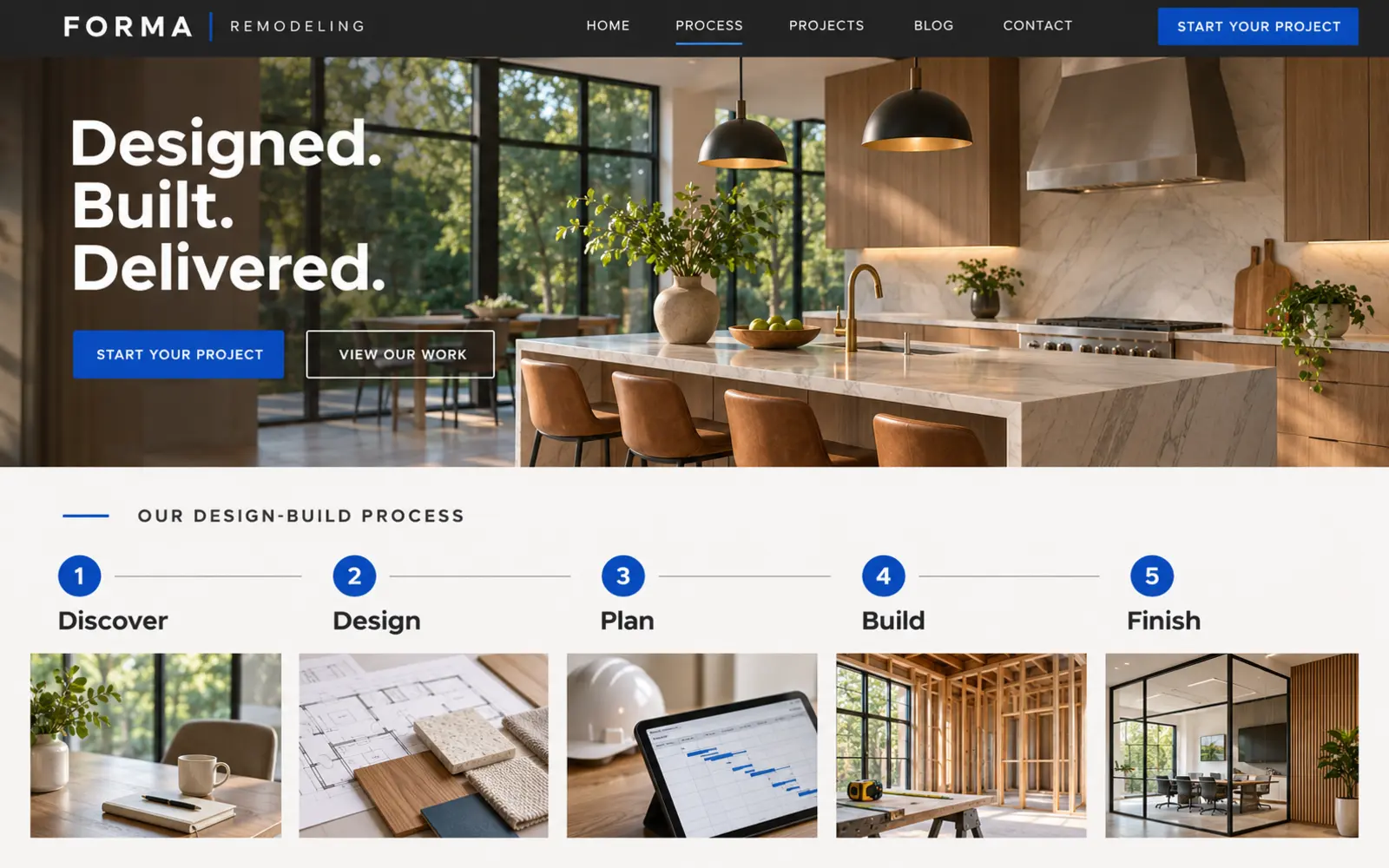
A modern process section should reduce uncertainty without becoming a project manual. This concept gives the system a memorable name, such as The Reimagine Process, then uses six visual stages: Discover, Design, Select, Plan, Build, and Complete. Each stage has one concise sentence and links to deeper information when a customer wants more detail.
Explain who participates, what the customer receives, how decisions are documented, and when pricing or scheduling becomes reliable. If architects, engineers, interior designers, or specialty trades may be involved, describe how coordination works without claiming services the company does not provide.
Residential clients may focus on selections, temporary living arrangements, and communication. Commercial clients may need phasing, access, submittals, change documentation, inspections, and closeout. The process should remain consistent while acknowledging those different priorities.
7. Help customers explore layouts and materials without overwhelming them
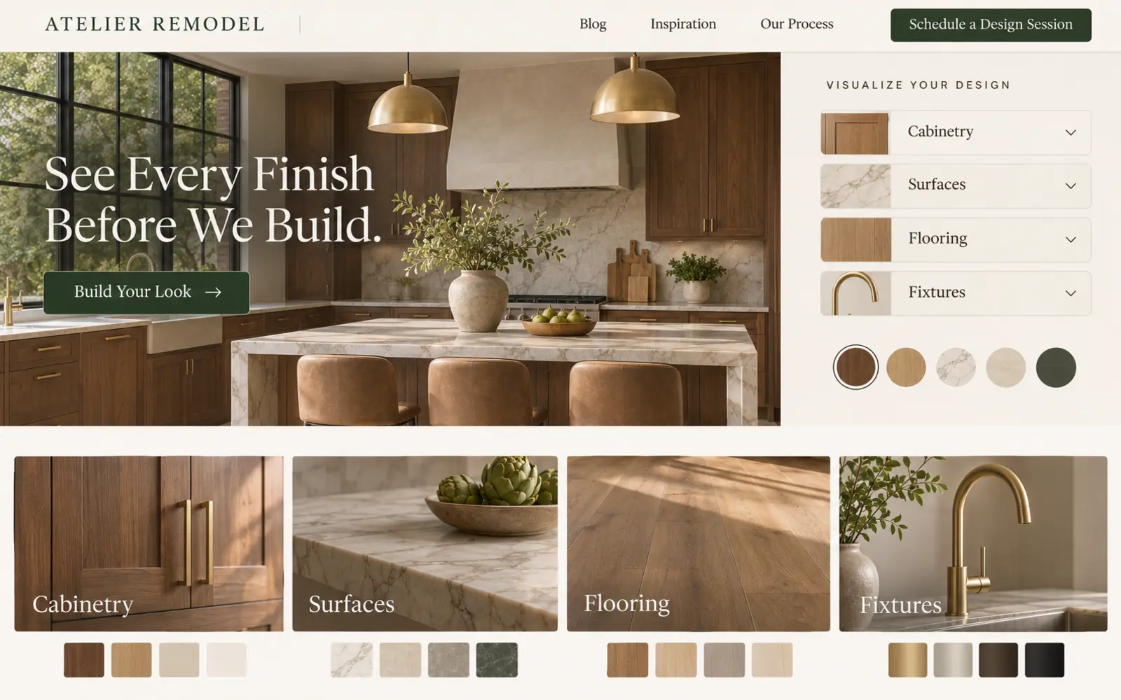
Customers want inspiration, but too many small samples and paragraphs can make a remodeling website feel like a catalog. This concept uses a large design visualization, a few curated material palettes, and simple options for layout, cabinetry, surfaces, flooring, lighting, and architectural details.
Explain where visualization fits within the actual engagement, what deliverables may be provided, how revisions are handled, and whether selections are made through the contractor, a designer, a showroom, or another partner. Digital previews should be presented as planning aids rather than exact representations of color, texture, or finished conditions.
Connect each selection resource to relevant projects and a design consultation. The goal is to help visitors articulate preferences and understand the decision process—not to ask them to design the entire project before speaking with the team.
8. Make occupied-space planning and phasing visible
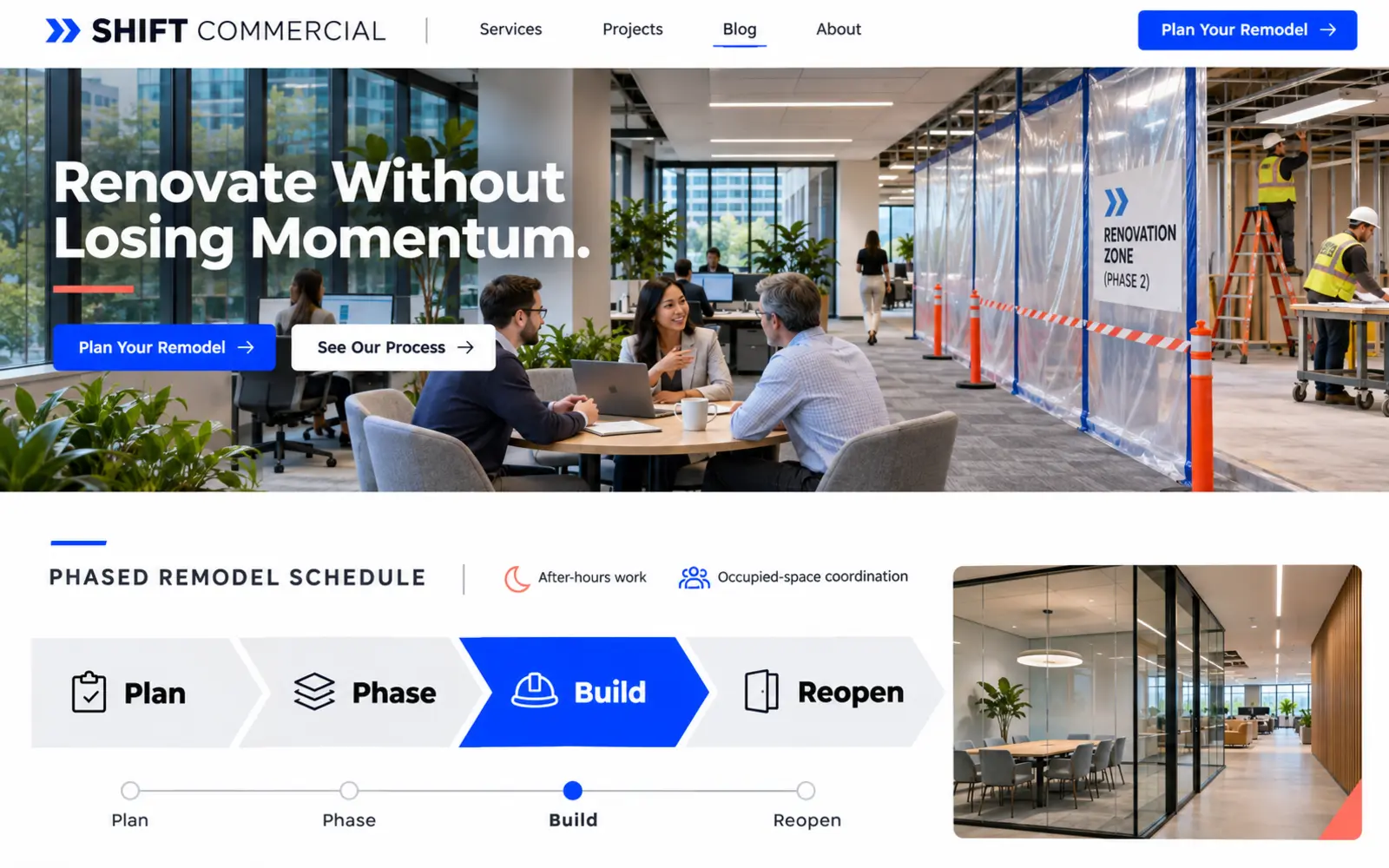
Many remodeling projects happen while people are living, working, shopping, or receiving services nearby. This concept explains how the company approaches access, work zones, site protection, dust and noise considerations, temporary closures, phasing, deliveries, daily communication, and schedule updates.
For residential projects, useful guidance may include kitchens, bathrooms, pets, belongings, utilities, and temporary access. For commercial work, discuss operating hours, customers, employees, tenants, fire or egress coordination, security, vendor access, and turnover according to the actual project type.
Avoid universal promises about zero disruption or exact completion dates. Show the planning and communication practices used to reduce uncertainty, then explain that the final approach depends on site conditions, scope, approvals, procurement, and coordination.
9. Connect service-area pages to real remodeling projects
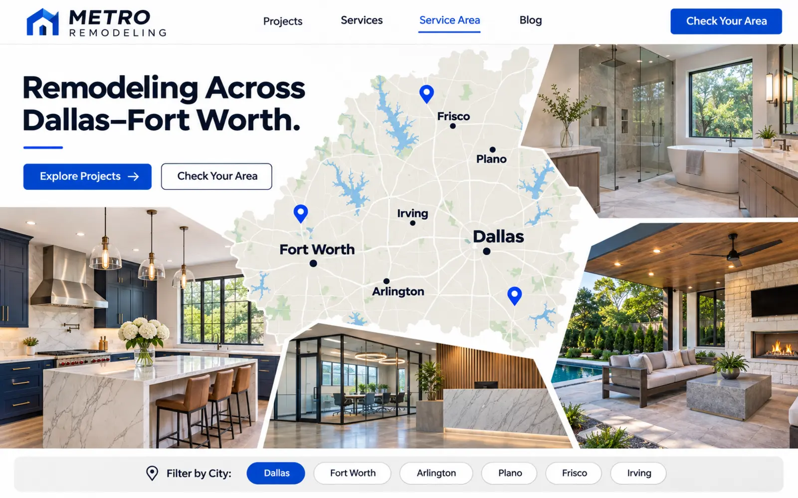
A useful local page should do more than repeat a city name. This concept combines a Dallas–Fort Worth service map with nearby remodeling projects, residential and commercial capabilities, property types, practical planning considerations, and a clear way to confirm consultation availability.
Local pages can address housing styles, building types, access, occupied environments, permitting considerations, and project examples when the information is accurate and useful. Connect each market to authentic work rather than producing nearly identical pages for every city.
Separate the core service area from project-based travel when appropriate. Route inquiries to the correct team and track which locations, services, and project types generate qualified conversations.
10. Create a complete bilingual remodeling customer journey
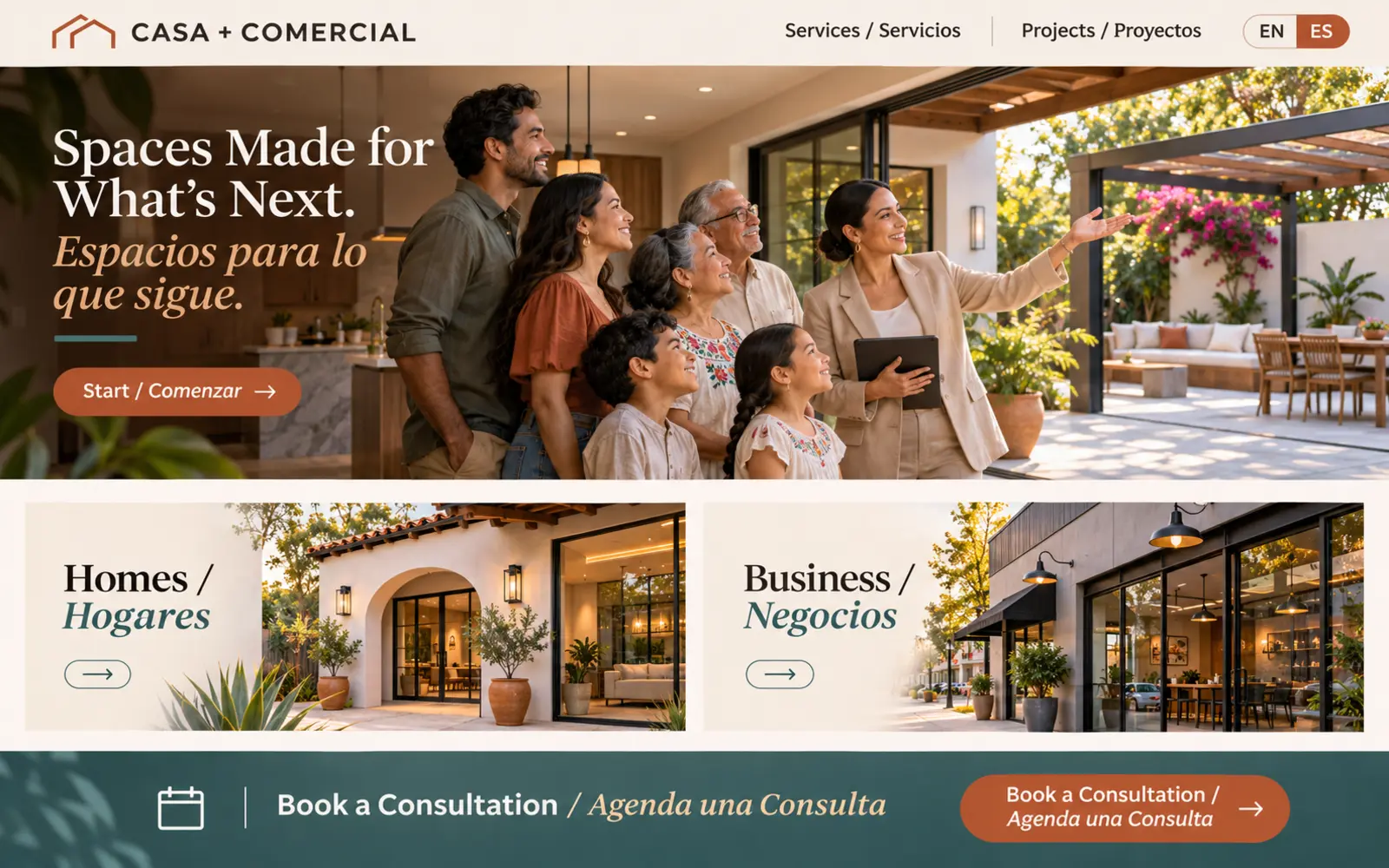
A language toggle is only useful when the entire experience supports it. This concept gives English- and Spanish-speaking visitors equal access to residential and commercial services, project galleries, planning guidance, forms, validation messages, confirmations, appointment details, and follow-up expectations.
Professional translation should account for regional language and remodeling terminology while remaining clear to homeowners and commercial buyers. Downloadable resources, automated messages, photo-upload instructions, and consultation reminders should stay consistent with the selected language.
The operating team must be able to respond accurately in the customer’s preferred language. Hispanos Marketing treats bilingual communication as part of a complete multicultural customer experience rather than a decorative addition.
Remodeling company website design checklist
- The homepage uses strong imagery, concise copy, and clear residential and commercial paths.
- Core services have focused pages with relevant projects and a clear consultation action.
- Projects include scope, property type, challenges, decisions, and completed results.
- The project planner collects useful details without asking visitors to diagnose technical conditions.
- Commercial buyers can find sectors, capabilities, coordination, documentation, and bid contacts.
- The process explains design, selections, planning, communication, construction, and closeout.
- Occupied-space guidance sets realistic expectations about access, protection, phasing, and disruption.
- Local pages contain useful market information and authentic nearby proof.
- Credentials, reviews, warranties, safety claims, and team information are current and verifiable.
- Large images and visual tools remain fast and usable on mobile devices.
- English and Spanish journeys are complete when bilingual service is offered.
- Calls, forms, consultations, proposals, and qualified lead sources are measured.
If the initial cost and upkeep of a traditional website are barriers, explore our managed website plans. They combine a professional website framework with hosting, routine maintenance, and technical support in one monthly plan.
Frequently asked questions about remodeling website design
What should a remodeling company website include?
A remodeling website should clearly present residential and commercial services, completed projects, process, service area, team, reviews, FAQs, consultation options, and contact information. Depending on the business, it may also need design resources, material guidance, commercial capabilities, plan uploads, financing information, warranties, and bilingual content.
How can a remodeling website generate more qualified leads?
Help visitors identify the relevant service, see comparable projects, understand the process, confirm the service area, and submit useful property and project details. Focused service pages, local visibility, strong case studies, concise forms, reliable tracking, and prompt follow-up work together to improve lead quality.
Should remodeling companies show prices online?
Price guidance can be useful when it is current and properly framed. Remodeling costs vary with existing conditions, design, demolition, structure, systems, finishes, access, approvals, schedule, and many other factors. Example scopes, broad ranges, or starting investments may help qualification, but they should not be presented as final proposals without the required review.
What projects should appear in a remodeling portfolio?
Feature the work the company wants to win. Include relevant residential and commercial categories with multiple completed views, original conditions, scope, location or market, design decisions, challenges, and results. Authentic, well-labeled projects are more persuasive than a generic gallery.
How many pages does a remodeling company website need?
There is no universal number. A focused remodeler may need core service, projects, process, company, service-area, FAQ, and contact pages. A larger design-build or commercial firm may need individual service pages, sector pages, case studies, team information, planning resources, project-intake tools, and bilingual versions.
How often should a remodeling website be updated?
Add new projects, reviews, team changes, services, service areas, and planning resources as they become available. Review forms, tracking, integrations, mobile usability, accessibility, security, and page speed routinely so the website reflects the company’s current capabilities.
Build a remodeling website around the project decision
The best remodeling website is not the one with the most text or the largest gallery. It is the one that helps the right customer recognize relevant experience, understand the process, evaluate credible proof, and start a qualified conversation with confidence.
Hispanos Marketing designs conversion-focused websites for remodeling companies, contractors, and professional service businesses in Dallas–Fort Worth and nationwide. Explore our home builder website examples, construction company website examples, painting company website examples, deck and patio website examples, and hardscaping website examples, or review our website design service.
Book a call with Hispanos Marketing to discuss the right website structure for your remodeling company.