A strong construction website should do more than display attractive project photography. It should quickly explain what the company builds, where it works, why prospective clients should trust it, and how a qualified customer can start a conversation.
The ten original concepts below demonstrate different ways construction companies can combine project imagery, credibility, service information, and conversion-focused calls to action. If your current site is difficult to navigate, outdated, or failing to generate the right inquiries, explore our approach to professional website design for construction companies.
Article overview
This guide presents ten construction website hero concepts, with each example emphasizing one important feature: video, positioning, project proof, trust signals, service selection, audience segmentation, local relevance, lead capture, process clarity, or bilingual access. Every concept also assumes the same foundation—a responsive layout, readable typography, clear navigation, accessible controls, and a focused next step.
Key takeaways
- Visitors should understand what the company builds, whom it serves, and where it works within seconds.
- Real project imagery and well-explained case studies provide stronger proof than broad claims.
- Licensing, safety credentials, reviews, and a clear process help reduce perceived risk.
- Every important page should guide visitors toward one primary action.
- Mobile usability, accessibility, and loading performance are fundamental parts of the design.
- The strongest construction websites reflect the company’s actual market instead of relying on generic contractor language.
What every construction website should include
The appearance of a construction website should reflect the company’s market and level of work, but its underlying responsibilities remain consistent.
| Website element | What it should accomplish |
|---|---|
| Clear value proposition | Explain what the company builds, who it serves, and what makes its approach relevant. |
| Services and sectors | Confirm that the company handles the visitor’s type of project. |
| Project photography | Demonstrate workmanship, capabilities, scale, and project experience. |
| Reviews and credentials | Reduce uncertainty through evidence, qualifications, and third-party trust. |
| Service areas | Help visitors determine whether the contractor works in their location. |
| Primary call to action | Provide one obvious path to request an estimate, discuss a project, or verify availability. |
| Process information | Explain what working with the company will involve and what happens after contact. |
| Mobile performance | Make the website fast, readable, and easy to use for people researching from a phone. |
These elements support the larger standards discussed in Why Your Business Needs a Modern Website: What the Data Shows.
1. Use video to tell the project story
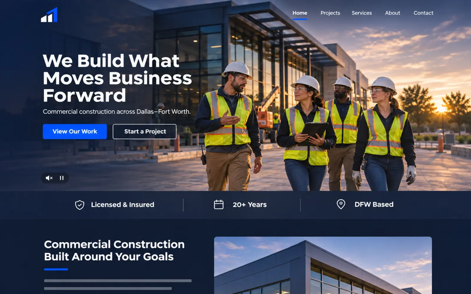
What this design emphasizes: A full-width, muted project video showing crews, equipment, construction progress, and the completed result. A short value proposition and one prominent action remain visible over a controlled dark gradient.
Why it matters: Construction is highly visual. A carefully selected video can communicate project scale, workmanship, coordination, and professionalism before the visitor reads a detailed service page. It is especially useful for commercial builders, general contractors, concrete companies, and firms whose process is difficult to communicate through one photograph.
How to use it: Keep the clip short, compress it appropriately, provide a static fallback image, preserve readable contrast, and never autoplay sound. The video should support the message—not delay access to it.
What to avoid: Long cinematic introductions, oversized files, rapid cuts, weak text contrast, or footage that looks impressive but does not represent the company’s actual work.
2. Lead with a clear construction value proposition
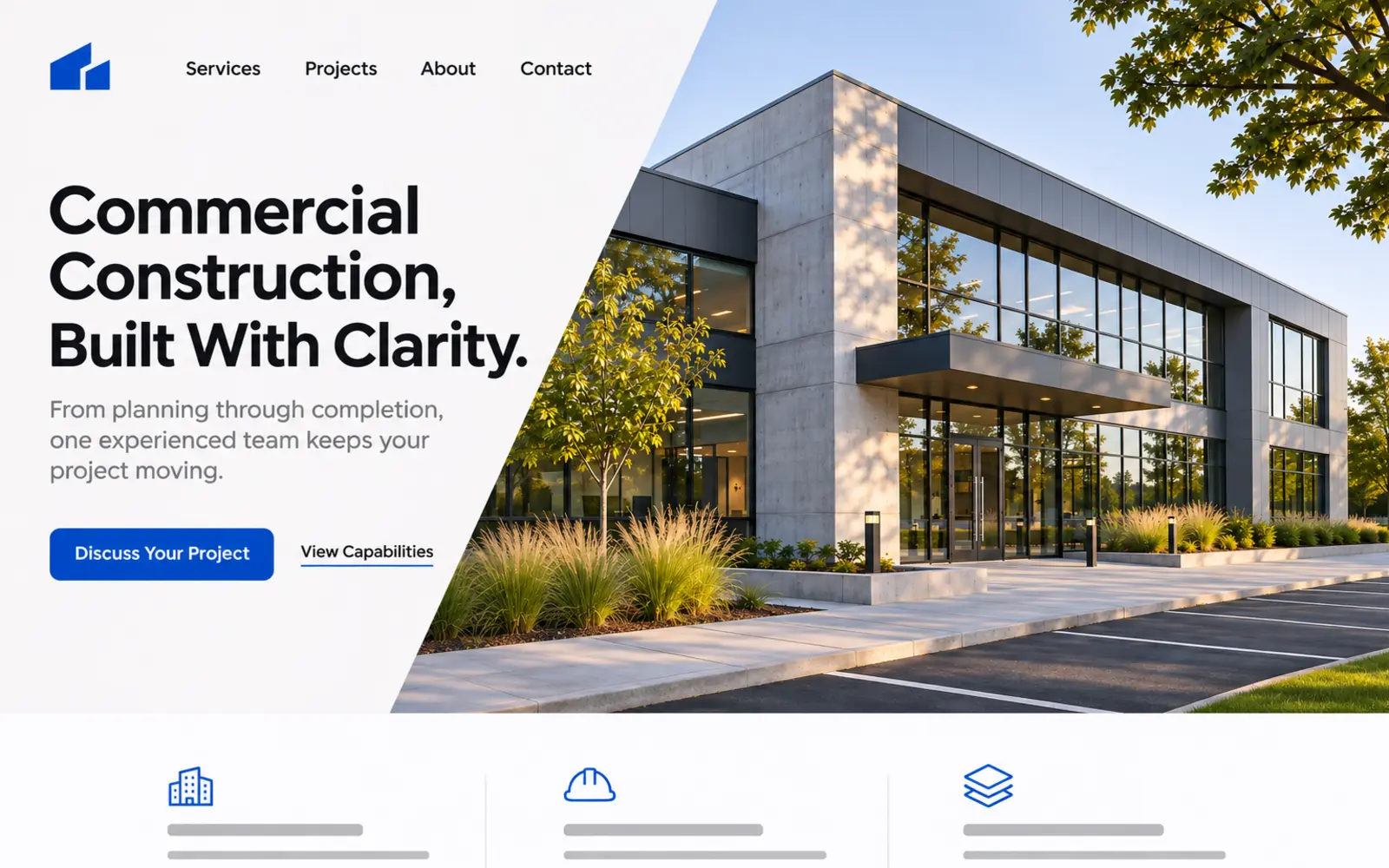
What this design emphasizes: A direct headline stating the contractor’s specialty, customer type, service area, and primary outcome. The design uses one strong project image, a concise supporting sentence, and a single primary call to action.
Why it matters: Many construction websites lead with broad language such as “quality you can trust.” That statement does not tell a visitor whether the contractor builds commercial interiors, custom homes, civil infrastructure, or concrete foundations. Focused positioning helps the right prospect recognize relevance quickly.
How to use it: Build the headline around the company’s most important market, project type, and location. Add a supporting statement explaining the practical difference in the experience. The button should describe a reasonable next step, such as “Discuss Your Project,” rather than demanding an immediate commitment.
What to avoid: Unsupported superlatives, long mission statements, several competing buttons, or a headline broad enough to describe every contractor in the market.
3. Make completed projects the primary proof
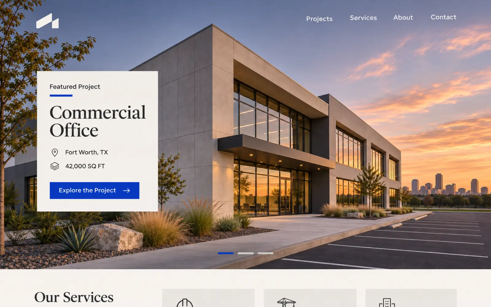
What this design emphasizes: A completed project becomes the central hero image, supported by the project type, location, scope, and a direct path to view the full case study.
Why it matters: Prospective clients want to see evidence that a contractor has completed work similar to what they are considering. A project-first experience makes capability easier to evaluate and gives the company a credible way to discuss complexity, coordination, materials, schedule, and problem-solving.
How to use it: Select a representative project rather than simply the most dramatic photograph. Include useful context and build a complete project page with multiple images, the challenge, the company’s role, and the finished outcome. Obtain permission before sharing client-sensitive details.
What to avoid: Unlabeled image galleries, stock photography presented as company work, before-and-after images with inconsistent angles, or performance claims that cannot be supported.
4. Reduce risk with credentials and trust signals
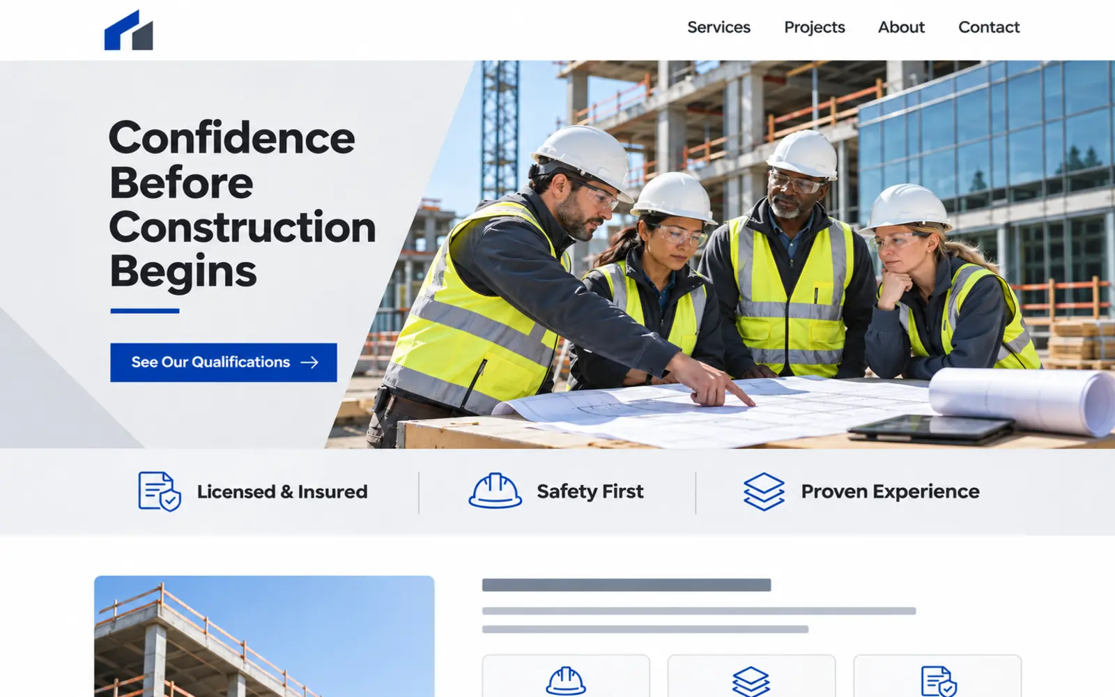
What this design emphasizes: Restrained trust signals placed beside a strong crew or project image. Relevant licensing, insurance, safety qualifications, years of experience, review information, and recognizable client sectors support the primary message.
Why it matters: Construction decisions involve financial, scheduling, operational, and safety risk. A professional appearance may earn attention, but specific proof helps a prospective client determine whether the company should move forward in the evaluation process.
How to use it: Display only current and verifiable credentials. Link to a qualifications or company page where visitors can understand safety practices, bonding or insurance capabilities, service history, and relevant certifications. For larger commercial firms, a concise downloadable capabilities statement may also be appropriate.
What to avoid: Decorative certification icons with no explanation, outdated badges, invented statistics, fake reviews, or a dense wall of logos that overwhelms the company’s actual value proposition.
5. Help visitors select the right construction service
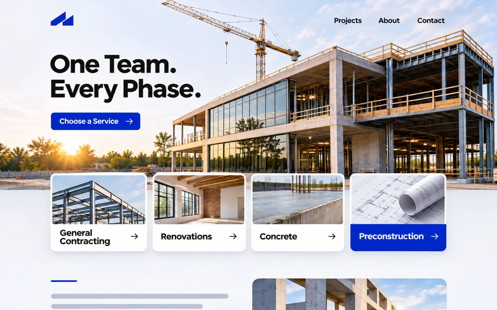
What this design emphasizes: Three or four major service paths appear directly beneath the opening statement. Each choice uses plain language and a clear destination.
Why it matters: Construction firms often provide several related capabilities, but a long undifferentiated service list can make the company difficult to understand. Clear service selection lets visitors confirm that the contractor handles their need and moves them toward more specific information.
How to use it: Group services according to how customers search and make decisions—not according to internal departments. Give each important service a dedicated page that explains the work, process, typical customer, related projects, service area, and next step.
What to avoid: Technical terminology customers do not use, ten equally prominent service cards in the hero, duplicate pages with only a city or keyword changed, or service links that lead to thin descriptions.
Need a clearer structure for your services and projects? Explore Hispanos Marketing’s conversion-focused website design services.
6. Separate residential and commercial customer journeys
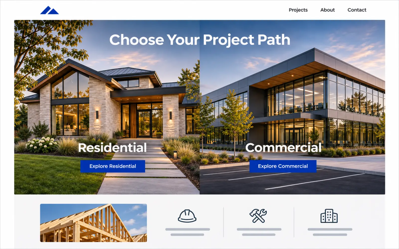
What this design emphasizes: A two-path hero allows visitors to identify whether they need residential or commercial construction information. Each path leads to relevant services, projects, proof, terminology, and calls to action.
Why it matters: Homeowners and commercial decision-makers may hire the same company, but they rarely evaluate it in exactly the same way. A homeowner may prioritize communication, financing, disruption, and examples of finished spaces. A commercial buyer may look for safety, scheduling, capacity, documentation, and experience with similar facilities.
How to use it: Create meaningful differences after the selection. The commercial path should not simply repeat the residential page with a new photograph. Tailor the project examples, process, terminology, FAQs, qualifications, and contact experience to each audience.
What to avoid: Forcing visitors to choose before they understand the company, hiding shared information, or creating segmented pages that contain no genuinely audience-specific value.
7. Establish local relevance immediately
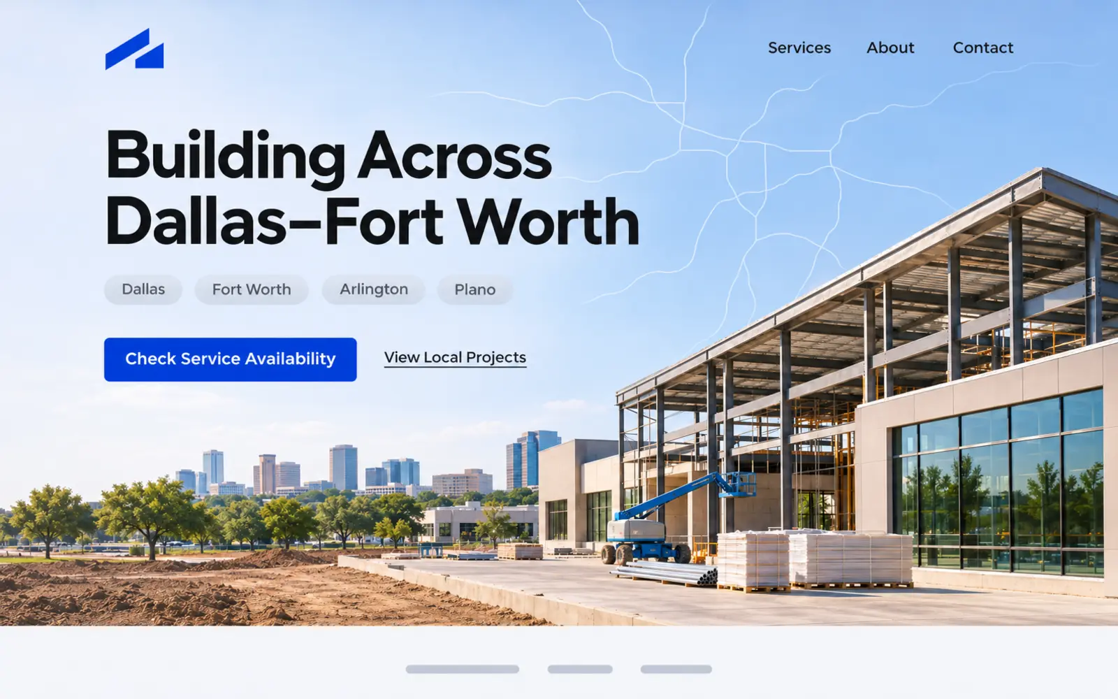
What this design emphasizes: The hero clearly communicates Dallas–Fort Worth coverage, supported by recognizable local project context, a service-area statement, and a practical way to confirm availability.
Why it matters: A visitor should not have to search the footer to determine whether a contractor serves the project location. Local clarity improves the customer experience and helps the company connect its services, projects, and expertise to the markets it actually serves.
How to use it: Name the primary market naturally, explain the realistic service radius, and support the claim with relevant project pages or useful regional information. If the company works nationally, clarify which services are local and which can be delivered across a broader territory.
What to avoid: Repeating dozens of city names, producing near-identical location pages, claiming areas the company cannot reliably serve, or adding local language that does not help the visitor make a decision.
8. Make the estimate request easier to begin
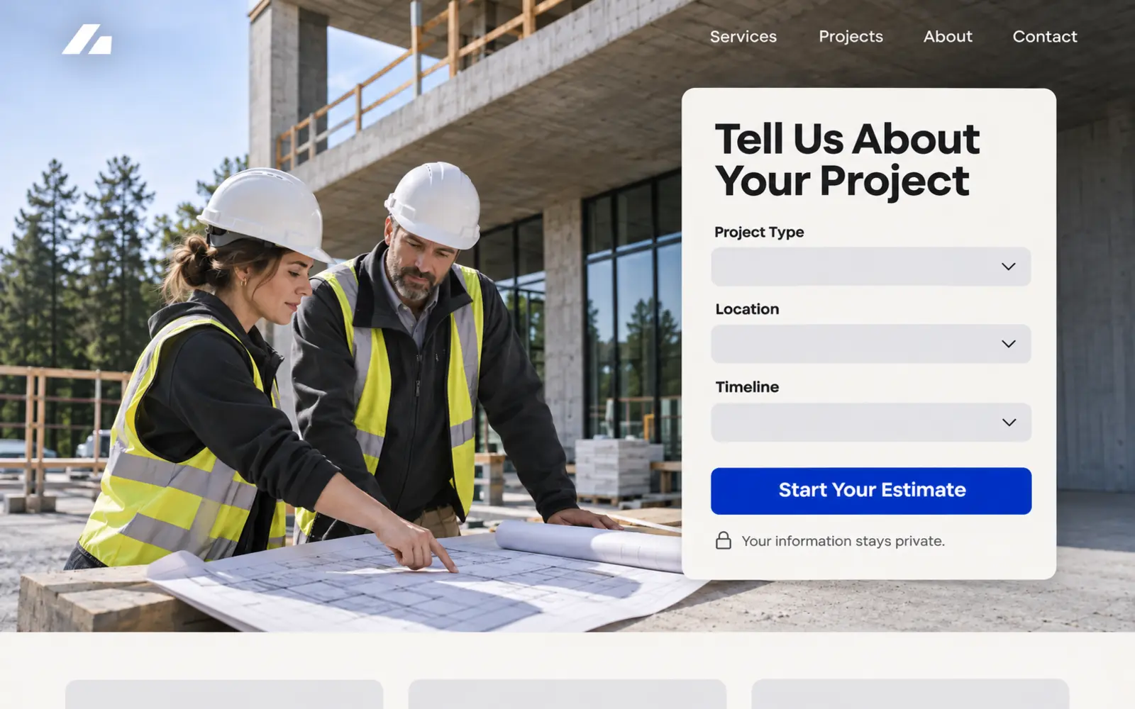
What this design emphasizes: A compact project qualifier begins with a few useful questions such as project type, location, timeline, and preferred contact method. The company explains what will happen after the form is submitted.
Why it matters: “Contact us” provides little direction, while an extremely long intake form creates unnecessary friction. A focused first step helps the customer organize the request and gives the contractor enough context to determine how to respond.
How to use it: Ask only for information needed for the initial conversation. Use clear labels, large mobile controls, useful validation, and an accessible confirmation message. If a question is sensitive or difficult to answer, explain why it is being requested or save it for the consultation.
What to avoid: Requiring a detailed project specification before contact, asking for unnecessary personal information, hiding the phone number, or promising an estimate before the company has reviewed the project.
9. Show customers what the construction process will feel like
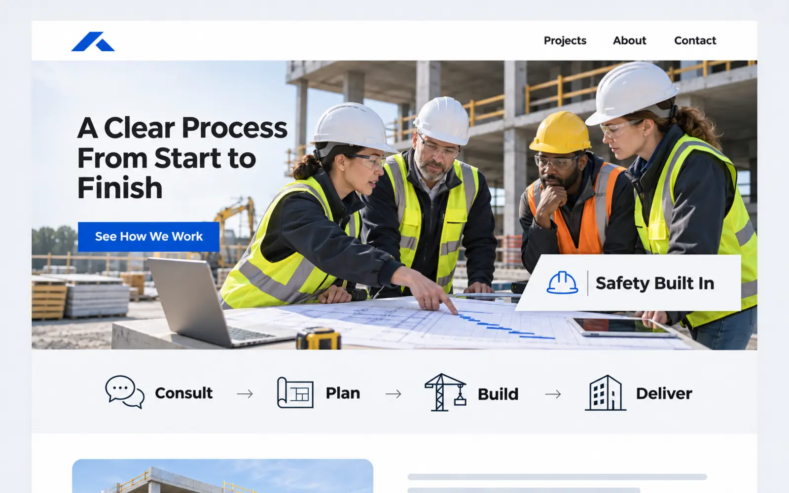
What this design emphasizes: A clean process preview introduces consultation, planning, construction, communication, safety, and completion. The design signals that the company manages both the physical work and the customer experience surrounding it.
Why it matters: Prospective clients are not only evaluating the finished product. They are evaluating uncertainty: how the project will begin, who will communicate, what will be required from them, how changes are handled, and what standards guide the work.
How to use it: Present an honest high-level process and connect it to a more detailed page. Explain how responsibilities, approvals, scheduling, site access, safety, documentation, and closeout may work. Adapt the process for the company’s actual project types rather than copying a generic four-step formula.
What to avoid: Promising identical timelines for every project, oversimplifying complex work, or describing a polished process the company does not consistently deliver.
10. Create an authentic bilingual customer experience
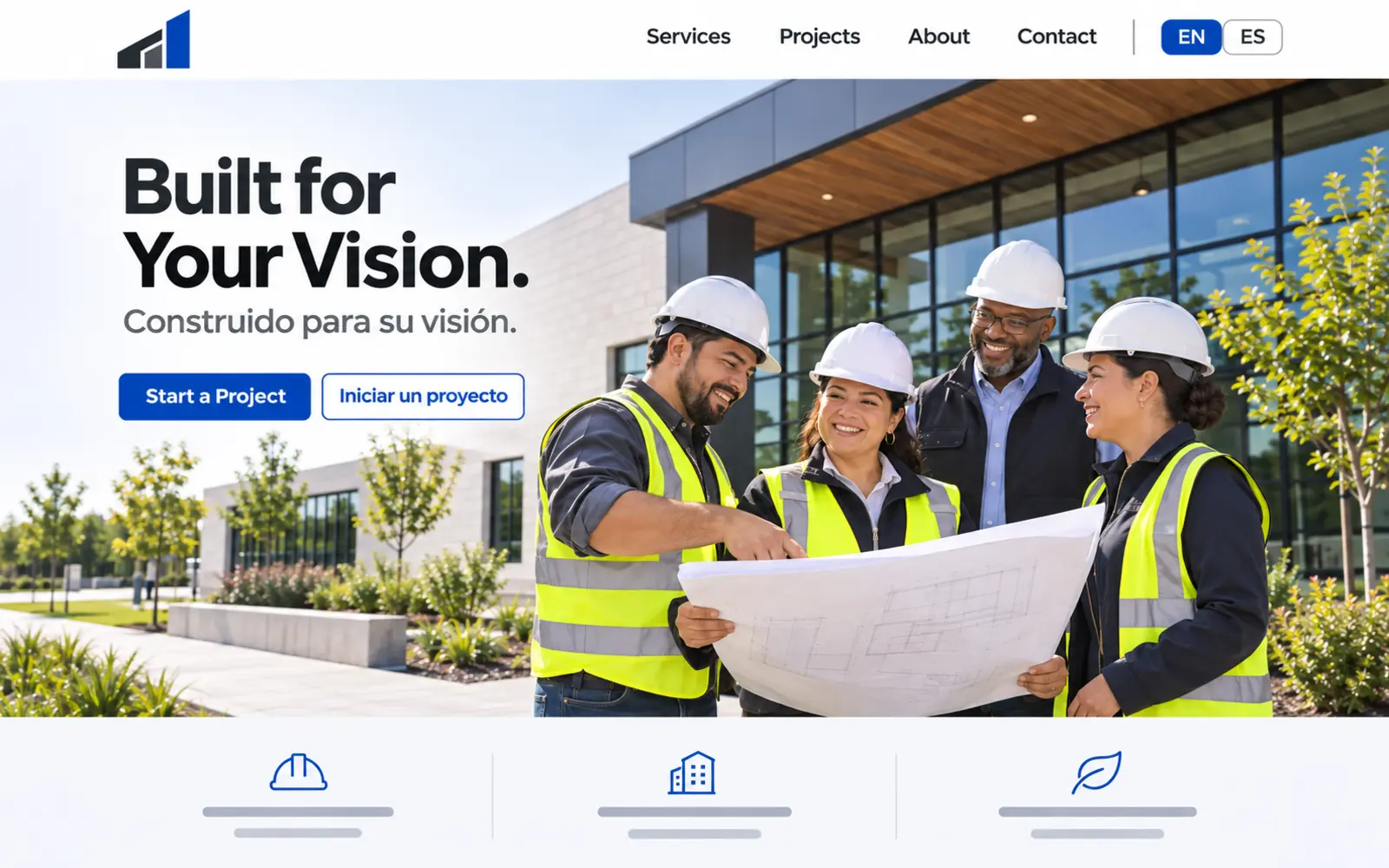
What this design emphasizes: A visible English and Spanish pathway supported by inclusive, professional imagery and messaging written for the audience rather than translated word for word.
Why it matters: Language access can improve understanding, confidence, and communication for customers, workers, vendors, and project partners. For companies operating in diverse markets, bilingual content can also demonstrate that multicultural communication is part of the organization—not an afterthought hidden in the footer.
How to use it: Translate the complete decision journey, including navigation, forms, service descriptions, confirmation messages, accessibility labels, and follow-up expectations. Have fluent professionals review industry terminology and tone. Maintain both versions when services or offers change.
What to avoid: Machine-translating isolated pages, mixing languages unpredictably, using stereotypes, or presenting a language selector that leads to incomplete or outdated information.
Construction website self-assessment checklist
Use this checklist to evaluate whether your current website supports how prospective customers research and select a contractor:
- The opening section explains what the company builds and who it serves.
- The primary service area is immediately understandable.
- The main call to action describes a realistic next step.
- Important services have dedicated, useful pages.
- Projects include context instead of functioning as an unlabeled photo gallery.
- Licensing, qualifications, and trust signals are current and verifiable.
- The process explains what customers can expect.
- Navigation, forms, and buttons work properly on mobile devices.
- Images and videos are optimized so they do not unnecessarily delay the page.
- Forms have clear labels, validation, and confirmation messages.
- Contact information and service areas are accurate.
- Someone is responsible for reviewing and updating the website.
A website does not always need a complete redesign. It may need clearer positioning, stronger project proof, improved service pages, or a better path from interest to inquiry. Our guide to reaching your ideal client explains how market understanding should shape those decisions.
Frequently asked questions
What should a construction company website include?
A construction website should clearly explain the company’s capabilities, customer types, service areas, qualifications, process, and next step. It should also provide representative project examples, useful service pages, responsive mobile navigation, accurate contact information, and visible proof that supports important claims.
How many pages does a construction website need?
The appropriate number depends on the company’s services, audiences, markets, and available proof. A focused contractor may need a homepage, about page, service pages, project gallery, process page, and contact page. Firms with multiple sectors, locations, or project types may need a larger content structure. Page count should follow customer needs rather than an arbitrary target.
Should a construction website use video?
Video can be valuable when it represents real work and is properly optimized. Use short muted clips, a static fallback image, readable text contrast, and controls when appropriate. Do not allow the video to delay essential information or make the mobile experience difficult to use.
Can a construction website help with local SEO?
Yes. A clear website gives search engines and customers useful information about services, service areas, projects, expertise, and contact details. Local visibility also depends on accurate business profiles, technical accessibility, relevant content, links, reviews, competition, and ongoing optimization—not simply repeating city names.
How often should construction project information be updated?
Add projects when they demonstrate a useful capability, market, challenge, or outcome. Review service information, credentials, team details, forms, links, and calls to action at least quarterly. Update material business information whenever it changes. For a practical system, see How to Keep Your Website Current With AI.
What if the company does not want to manage the website internally?
A managed arrangement can combine professional design with hosting, routine maintenance, content assistance, and technical support. Hispanos Marketing offers managed website plans for businesses that want a dependable site without handling every update themselves.
Build a construction website designed to support growth
The strongest construction website is not necessarily the one with the most animation or the longest service list. It is the one that helps the right customer recognize the company’s relevance, evaluate its capabilities, trust its process, and take the next step with confidence.
Hispanos Marketing designs strategic, mobile-responsive websites for contractors, construction companies, and professional service businesses across Dallas–Fort Worth and nationwide. We connect positioning, design, content, performance, and search foundations so the website functions as part of a larger growth system.
Explore website design services or book a call to discuss your company’s next website.